I've
been working on this post for a while-mainly because I am technologically
challenged and seem to attract problems with the computers/internet. It took me
forever to get the pictures transferred from my phone to the computers, let alone in the right size or format. Like I said, I am technologically challenged with a magnet that seems to attracts computer problems (i.e. in the four years of college, I managed to break/screw up/virus, etc. 7 computers)
I
created this blog as a way to document the process on buying our first house and making
it my our home. The very first post
described how my boyfriend, Ryan, and I recently purchased our first (and most
likely, only) home. We've been here for a few months now and it no longer looks
so….retro? 1970’s? Groovy? It took a lot to look past the outdated décor and I was very hesitant about putting an offer on this house, let alone consider it. Ryan fell in love with it immediatly and was absolutely able to see past the ugly carpet in the kitchen, outdated décor, and ugly wallpaper, but
just to give you an idea, these are some “before” pictures.
Some
are from the original listing with the previous owners furniture and decorations, and others are from my phone during the
renovation process. It is still an ongoing process, but here you go…
Ignore the fact that these pictures are of horrible quality. I am not a photographer nor do I have a fancy schamncy camera-if I am taking the picture, it usually comes from my phone.
Outside of the house:
 |
| The front of the house actually faces that back, I love that |
Patio:
Foyer:
 |
| Stairs lead to the laundry area, basement, and garage. Check out that carpet! |
 |
| One of the main features that really sold us on the home (The giant brick fireplace, definitely not the giant fish) |
 |
Dining Area:

Its hard to see from the pictures, but that is actually an orange carpet. A 40 something year old orange carpet
Kitchen:
 |
| Just in case you were wondering, that is the same CARPET as the stairs leading into the laundry. Yes, carpet in the kitchen. Talk about retro |
 |
| Double ovens built into the brick. Very Carol Brady. I love the double ovens but I'm already preparing for a nightmare when we have to replace them |
Hallway:
Main Bathroom:
 |
They don't even make toilets like that anymore.
 |
| It looks like Kermit the Frog exploded in this bathroom |
Office:
 |
| This picture has the closest represenation of the color of the original carpet. A dingy green-weird color |
 |
| Although hard to see in this particular photo, those are built in bookshelves into both sides of that wall, made of solid wood. |
 |
| The pictures from the office area are from when we moved in, but nothing had been done to the room. |
Second Bedroom:
Master Bedroom:
Master Bathroom:
 |
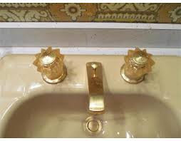
| Yep, that is some groovy wallpaper and matching tile. |
The house was built in the mid 1970's and nearly everything was original (i.e. wall color, carpets, fixtures, sinks, toilets, etc.) when we moved in.
Keep checking back as I will post "after" pictures for each room as I get around to it!
I didn't get any pictures of the laundry area, garage, or basement but I will be sure to post pictures as I re-do and re-organize this whole house and make it our home.


What a great house! Love the colors of typical 1970's home! Can't wait to see how it turns out. Kitchen is fantastic!
ReplyDeleteThanks! The kitchen is wonderfully large with TONS of cabinet space and counter top space. Easily one of the best features of the house.
ReplyDelete